
Canva has steadily grown from being a go-to design platform into a full creative suite aimed at simplifying how individuals and teams produce content. With the launch of Canva Visual Suite 2.0, the platform takes a bold step forward, combining familiar design tools with new AI-driven features, data handling, and even interactive code generation. The update is clearly positioned to serve not only designers but also marketers, educators, and publishers who need a balance of creativity and productivity in their daily work. In our organization, which shares the same visual and content-driven goals that Canva champions, we tested the new suite firsthand to see how well it actually delivers.
Canva Sheets
Starting with Canva Sheets, it feels like a breath of fresh air compared to traditional spreadsheet tools. With its prepared templates, the experience is design-first, perfect for creators who think visually. The interface is simplistic and not overwhelming, with plenty of templates suited for different industries. Customizing data is straightforward, and despite dealing with numbers, Sheets doesn’t feel overly “mathematical.” Everything is prepared for you, so productivity flows naturally.
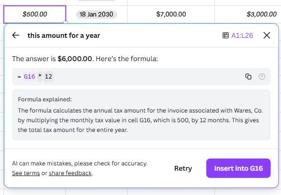
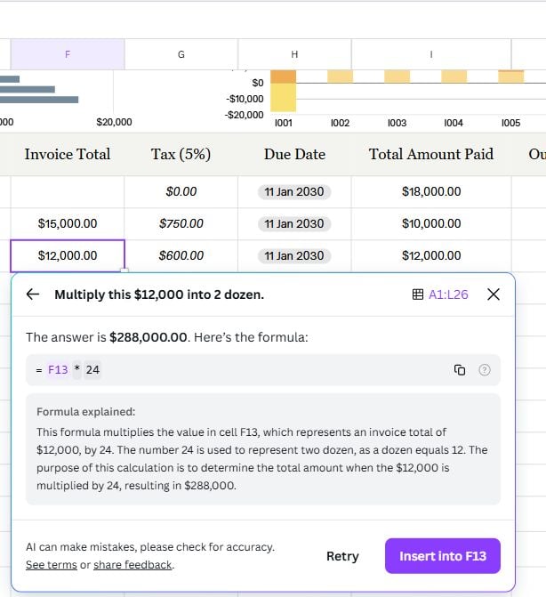
The Magic Formula is especially impressive. If you’re someone who struggles to remember Excel formulas, this feature becomes your best friend. Not only does it generate the right formula, but it also shows the solution and provides explanations with a single click. It understands contextual prompts too like interpreting “a year” as 12 months or recognizing “dozen” instantly. It’s sensitive to rows, columns, and surrounding inputs, making calculations intuitive. Speed is solid, usually 2–4 seconds depending on prompt complexity. While Canva Sheets can’t handle massive datasets like Excel, it’s more design-focused and it excels in use cases like content planning, production calendars, or presenting analytics visually.
Magic Insights adds another layer, though it can sometimes hit technical snags. It often displayed “technical issue on our end” messages, disrupting workflow. At this stage, it feels more like a bonus tool than a reliable core feature. With more stability, though, it could become an invaluable assistant for editors and marketers who want quick storylines from raw data.
Magic Studio at Scale
Where Canva Visual Suite 2.0 truly shines at scale is with Magic Studio at Scale. For teams or publishers managing tons of assets, this is a game-changer. You can import data, remove image backgrounds in bulk, generate multiple content variations, translate designs into different languages, and even bulk-create designs directly from Sheets. The ability to resize multiple designs in one step is a massive timesaver. For a digital magazine, for example, this makes tasks like content calendars far more efficient. Imagine generating multiple versions of layouts for different devices or campaigns, and then resizing them across platforms instantly, eliminating the most repetitive parts of content production.
Canva AI & Code
Canva AI is another blessing for content creators. In our experience, the text-to-image tool has been especially helpful in building quick storyboards. Just by prompting the angle or scenario, Canva generates 3–5 variations we can choose from, often hitting exactly what we imagined. While occasional “AI hallucinations” happen, we’ve found that better, more detailed prompting leads to sharper results. What makes it even more user-friendly is the ability to choose or specify art styles directly in the prompt, which is a lifesaver for creators who aren’t experts in design or illustration. The option to adjust image sizes also shows Canva’s focus on real-world user needs.


AI-generated video, meanwhile, feels like a sneak peek into the future. For instance, when prompted “a robot thinking about flood”, Canva smartly rephrased it into “robot contemplating flood impact,” and the final output was both creative and relevant. After generating a video, Canva even suggests possible improvements or refinements you might want, which makes the process collaborative. The only trade-off is the generation time, which can last for a minute or more, but that’s understandable given the complexity of video rendering.
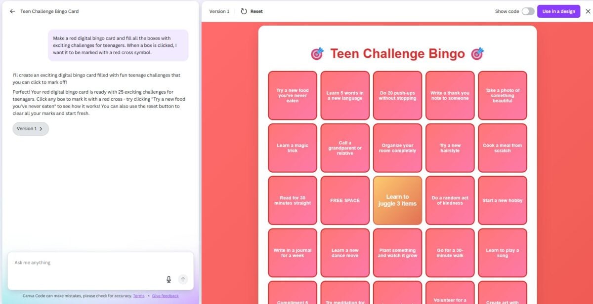
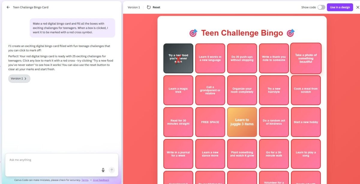
On the more technical side, Canva Code is one of the most exciting new features. Testing it with a prompt like “Make a digital bingo card filled with challenges for teenagers, with boxes that turn into red crosses when clicked”, Canva delivered exactly what we asked for. It’s surprisingly fast, and more importantly, it makes interactive, code-powered designs accessible to people who aren’t skilled programmers. The main limitation is that once the code is generated, you can’t directly tweak the source within Canva, you’ll need to adjust by rewriting prompts instead of manually editing text or styling. Still, it represents a powerful leap. Finally, a tool that bridges the gap between AI-assisted creativity and functional, interactive design.
Magic Charts
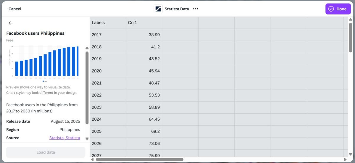
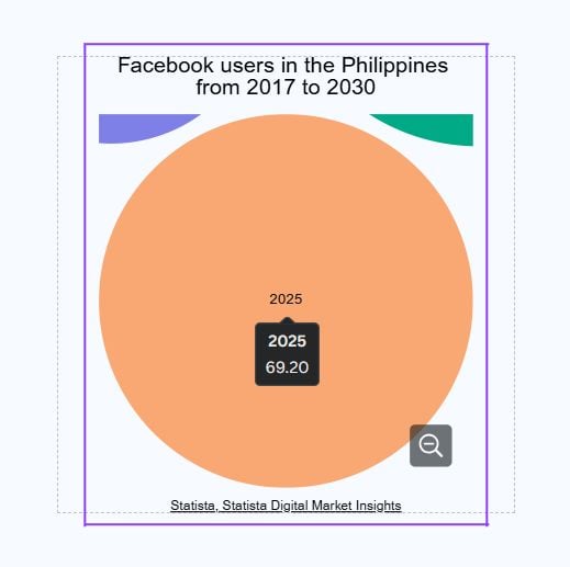
Magic Charts, meanwhile, feels like a big step forward for anyone who needs to turn raw data into something people actually want to look at. What makes it convenient is that Google Analytics, HubSpot, Google Sheets, and Statista are already built right into it, or simply upload your own file from your computer. We tried it with Statista’s data on “Facebook users in the Philippines between 2017 and 2030”. Canva initially recommended a stacked bar chart to present the data, which provided a brief overview of the trend. But what was impressive was the flexibility; we could easily switch the visualization into something more interactive, such as a packed circle chart. With that format, we could click on a circle by year, for example, 2025, and immediately view the precise user numbers. It wasn’t just a static graph, it was interactive, making the story behind the data much clearer.
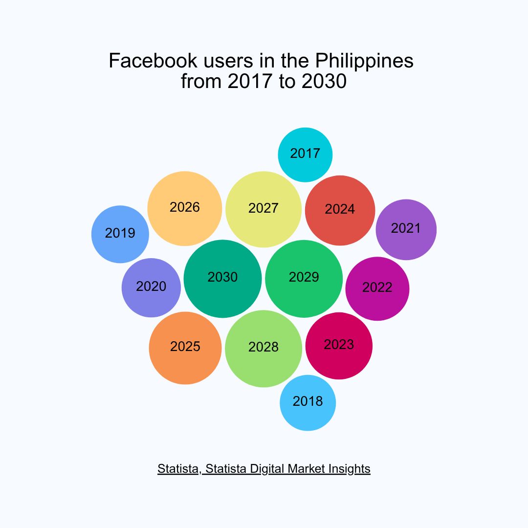
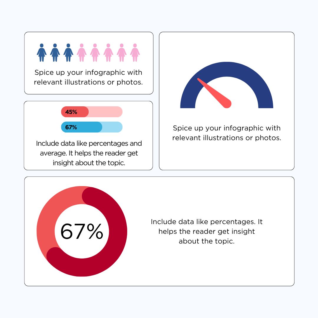
Out of all the chart options, the infographic-style charts stood out the most. What we liked about them is how they are able to merge design and data so that the information is not only easy to follow but also more memorable. Rather than showing plain lines and bars, these graphs use visuals, icons, and layouts that highlight the meaning of the numbers. To us, this has more effect on an audience; people recall the story that the chart tells rather than the numbers that it displays. While Magic Charts won’t replace the advanced analytics tools, it’s ideal for reports or presentations where impact matters as much as accuracy.
Advanced Photo Editing
Canva’s Advanced Photo Editing is another feature that makes day-to-day design work much smoother. We tested it out on a photo of a dog, specifically removing a ball next to it, and the result was seamless; there were no obvious traces of the editing. The background blended seamlessly, making it look like the ball had never existed in the beginning. For a person accustomed to needing to make edits perfect in other programs, this was a huge time-saver and surprisingly professional in output.


We also tested Canva’s Magic Grab feature, which allows you to choose and drag objects or text within an image. The experience was smooth; we could grab an object without distorting the layout or “messing up” on the rest of the design. All of it adjusted together as if it were built to be that way from the beginning. The most impressive thing was how natural the results appeared, no weird gaps and no mismatched textures. For rapid but excellent edits, this feature alone makes Canva more than a design tool, it’s becoming a go-to option even for sophisticated photo adjustments.

Canva clearly understands this generation’s mindset: everything needs to be visually appealing, whether it is for personal expression on social media or for money-making content in the digital economy. In that sense, Canva understood the assignment, and its continuous innovation reflects how content creators today live, think, and work. Canva Visual Suite 2.0 is also an impressive step forward for everyday creators and teams. Its greatest strength is accessibility, making advanced tools like AI, interactivity, and data visualization approachable even for non-specialists. It allows creators to move quickly without sacrificing design quality, while also streamlining repetitive tasks that usually slow down content production. For teams producing content at scale, educators building presentations, or publishers looking to repurpose assets efficiently, the suite offers a practical, design-first alternative to more technical software. While heavy data work or advanced coding may still require specialized platforms, Canva is setting the tone for how creativity and productivity will continue to merge in the years ahead.
Words by Aljhelyn Piador and Phia Manuell Layoso.
Also published in GADGETS Magazine v26n4.