Reviewed by Chris Noel Hidalgo
As a writer, I stare at my screen for hours on end, researching, procrastinating, writing, and procrastinating, on my office laptop. As you can tell, my workhorse’s screen is nothing to be excited about. Good thing the folks from Philips (you can check out their other products here and here) sent us the Philips 276E is. I had it as my driver for a few days and here are my thoughts.
Specifications:
LCD panel type: IPS-ADS LCD
Backlight type: W-LED system
Panel Size: 27-inch
Aspect ratio: 16:9
Optimum resolution: 1920 x 1080 at 60Hz
Response time: 14ms
Signal Input: HDMI/MHL, VGA, dual link DVI-D
Dimensions: 640 x 471 x 235mm
Weight: 5.33kg
Design: 4.5/5
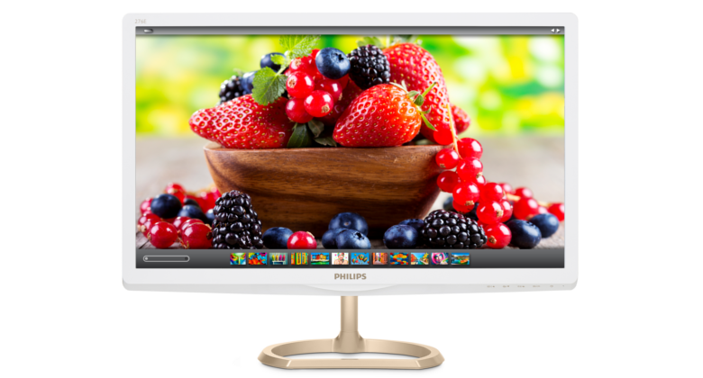
The Philips 276E looks really premium and at first glance reminded me of a famous fruit company. Our review unit was clad in white, with a pretty hefty bronze metallic stand. The front is all bare save for the Philips insignia centered on the bottom frame. On the bottom edge are touch-enabled controls for power, on-screen display menu, display format, signal input source, and SmartImage Lite which we’ll talk about in a bit.
Flip the unit around and you’ll be greeted by the corrugated back, on the bottom part of which are the input ports for your HDMI/MHL, dual link DVI-D, VGA, HDMI audio output, and power brick. On the far right of the array is a Kensington anti-theft lock eyelet.
Wrapping everything up is the giant 27-inch IPS-ADS LCD screen. Even with all the pixels that need powering, the 276E manages to remain slim and elegant. While I would have preferred the monitor and stand to be of one color, the entire package was right at home on my (messy) office desk.
Hardware: 4.5/5
The Philips 276E’s screen is an impressive, immersive affair with a 16:9 aspect ratio, a 1920 x 1080 resolution, and a 60Hz screen refresh rate. It also has a fairly okay response time of 14ms and 1000:1 contrast ratio. The monitor itself is pitched at 178-degrees while the stand is tilted -5/20-degrees. Though the display is physically gorgeous, there’s quite a lot of bezel surrounding it.
The whole display, in all its 640 x 471 x 235mm glory is built quite well and even though the stalk of the metal stand seems quite thin, it’s able to sufficiently hold the admittedly heavy display without any give.
User Experience: 4/5
Before I got my hands on this monitor, I always thought that big computer monitors were a fad. You shouldn’t really need anything bigger than 20 inches right? Well, that conviction was thrown right out the window into a blazing bonfire after I set up the Philips 276E.
Color outputs were excellent and vibrant, and contrast ratios were pleasing enough that black was almost completely black. Browsing websites as well as typing documents with font as small as 8-points didn’t strain my eye even though I was at it for quite some time. Binge-watching movies was, of course, great and the IPS panel provided great viewing angles, whether from the extreme left or right pitches, or dead center.
The experience is improved by Philips’ SmartImage Lite feature which adjusts the display’s brightness, contrast, color, and sharpness based on specified presets. In theory, it should give you an optimized viewing experience depending on the media you’re currently viewing. In practice, it only took a couple of menu presses to tune down the blinding white lights while browsing the web, increase text sharpness while reading documents, and enhance contrast ratio while playing video games and movies. If my eyes had thumbs, they will be upping them all over this feature.
I do have two grumbles though. First, the screen is sunk fairly deeply into the thick bezels surrounding it. Shame, though; image outputs could have stood out even more if it was equally as tall as its border, or if the bezels were made just a bit thinner. Second, the response time is a bit high so you’ll have just the slightest hint of input lag when playing games. Not that it’s branded as a gaming monitor—it is designed for productivity after all.
Value: 3.5/5
Is a gargantuan monitor necessary for office productivity or multimedia experience? No. Does it improve the overall aspect of computing, though? The answer’s a big, resounding yes. There’s nothing like having enough screen real estate to have two windows open at the same time—a browser being used for research and a word processor for taking down notes—side by side. There’s also no compare to having your own personal theatre screen that’s engaging and drool-worthy. Too bad about that bezel though.
What’s Hot:
- Crisp, Full HD resolution
- Looks really beautiful
What’s Not:
- Not a fan of the stand design
- Bezels a tad too thick
Bottomline
Once you go big, you’ll never go back.
Final Score: 16.5/20


